Comparing Differences
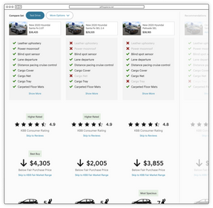
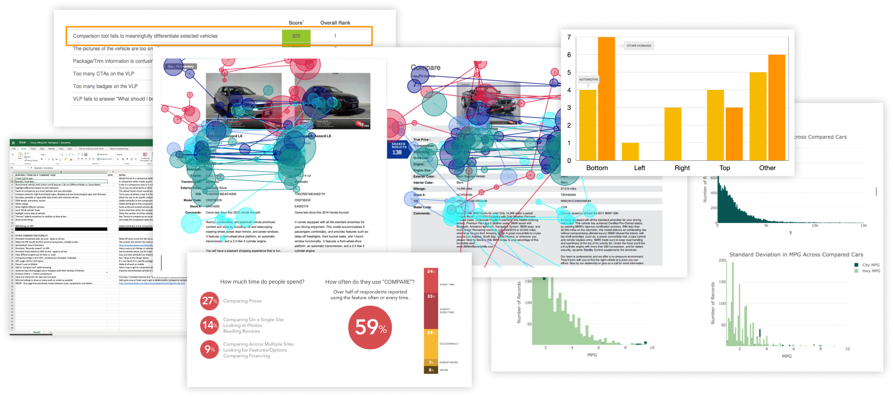
A top frustration for car shoppers is not being able to understand what equipment a vehicle has and how that affects its price. Using design thinking techniques and both qual and quant research methodologies, including nationwide surveys and user interviews, we uncovered a number of key areas where improvements would have the biggest impact.
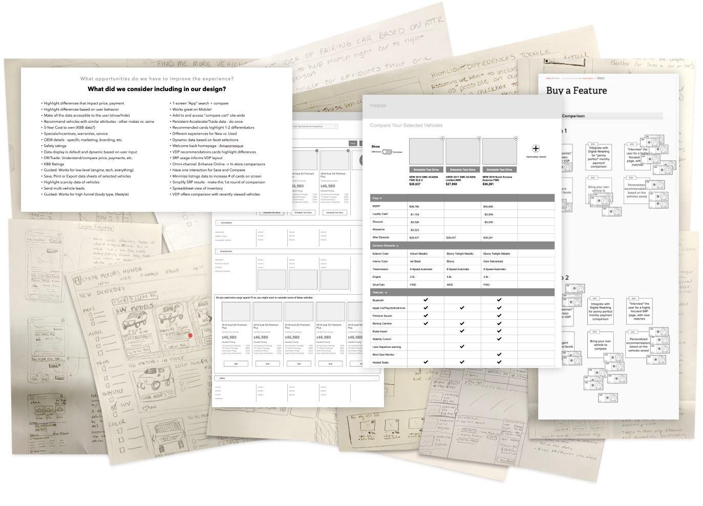
I involved product and engineering leaders in the UX team's Google Design Sprint processes. This led to early buy-in, a sense of shared ownership, and excitement over new possibilities as we iterated on improving functionality and ease of use.
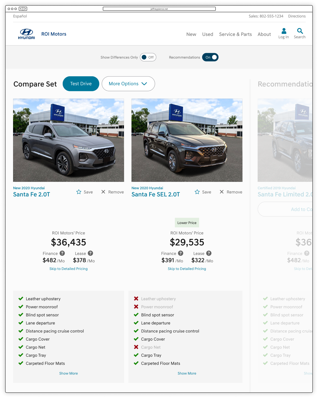
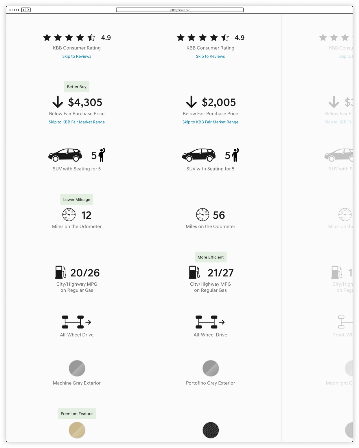
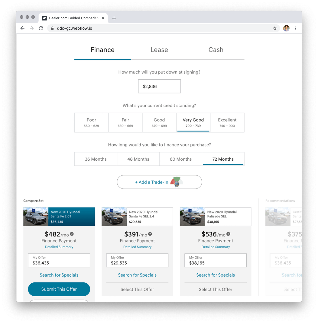
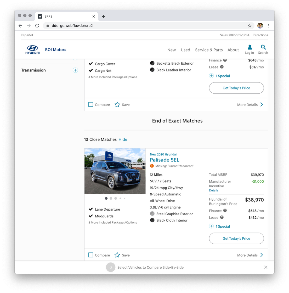
Our goal was not just to create a comparison page, but to integrate new "decision-making" functionality throughout the site and help shoppers understand what goes into a car's pricing. We tested (shown below): high-level visual comparisons with callouts, recommended searches based on previous inputs, "near" matches, multiple vehicle cost calculator tools, weighing must-have features vs. nice-to-have features, and many other small interactions.
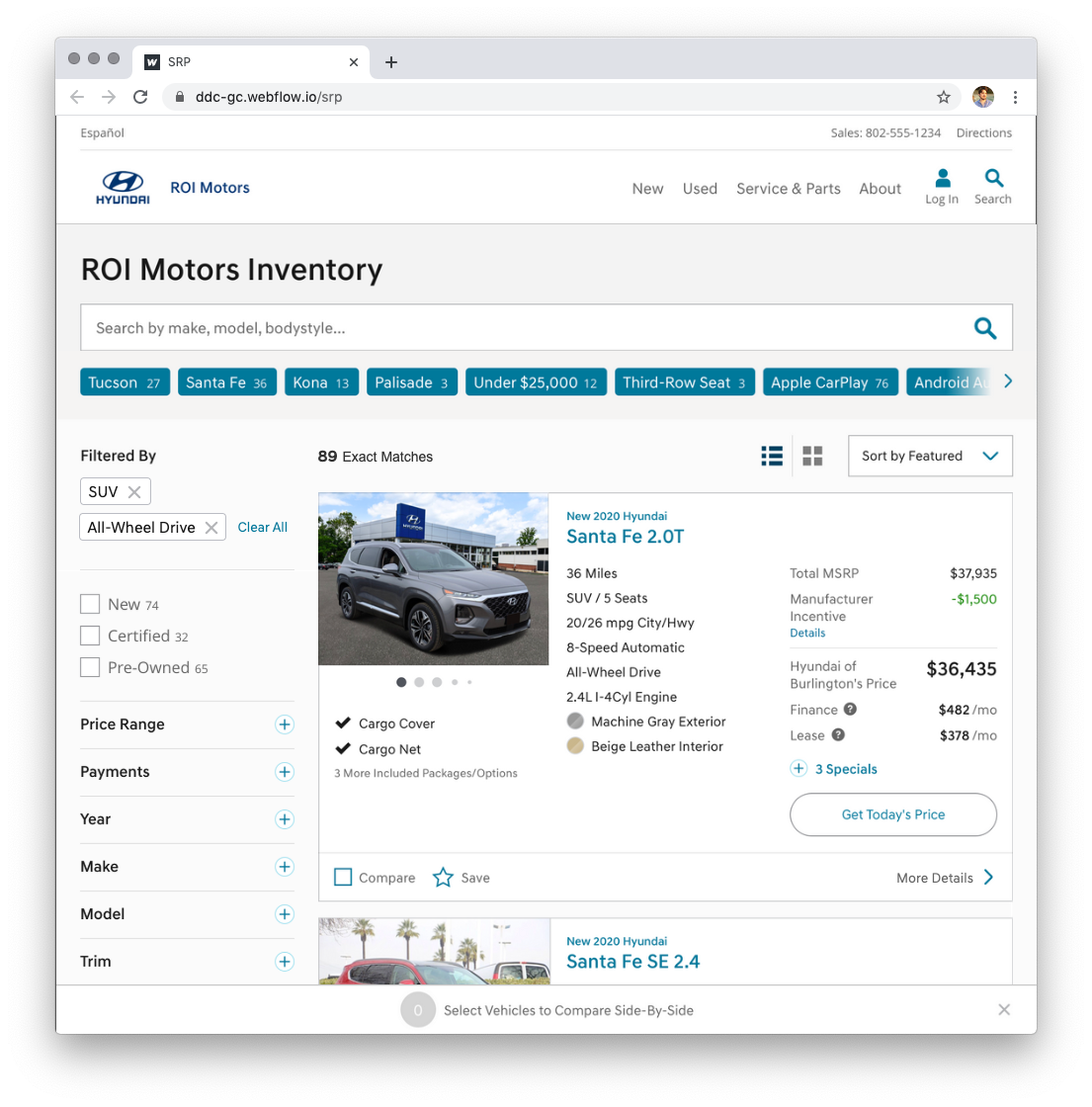
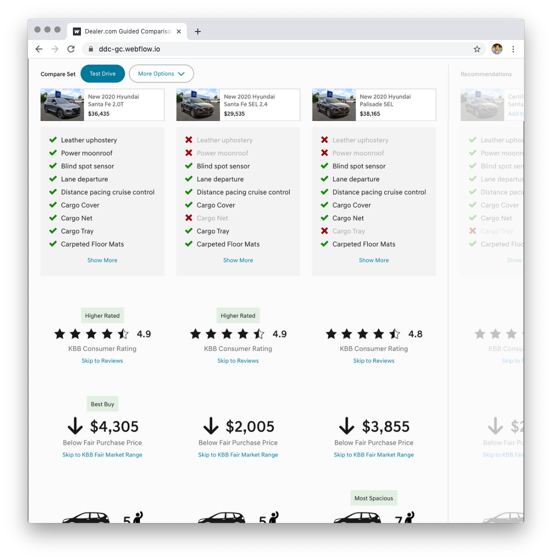
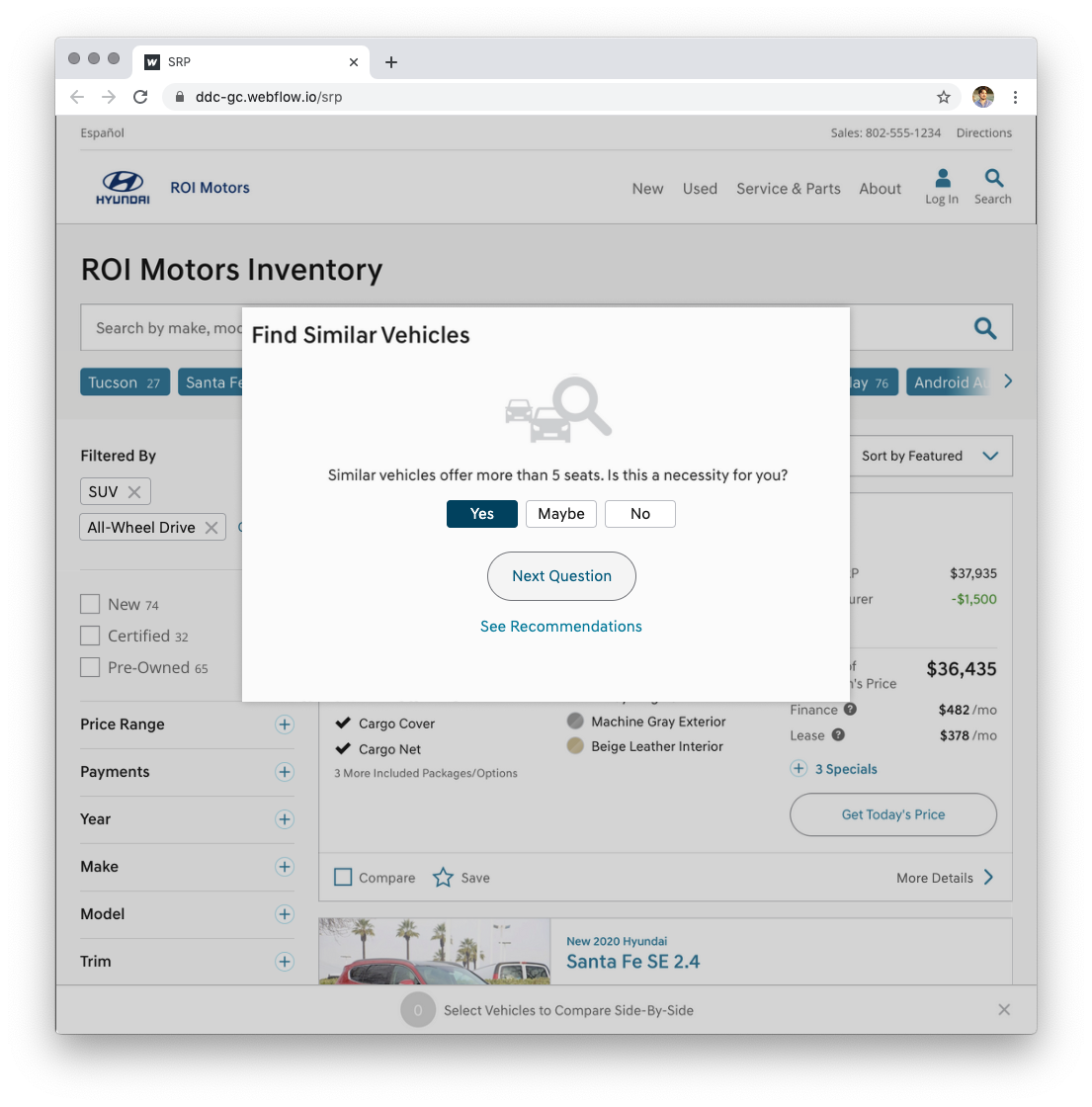
User Interview Feedback Video
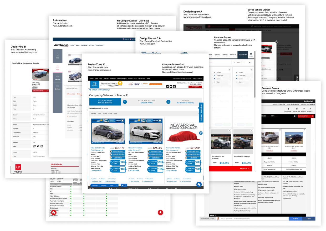
Summary of Competitive Analysis
User Research and Eye-tracking Results
Design Thinking Materials and Prototypes
